How to Decorate with Floral Wallpaper Without It Feeling Old-Fashioned
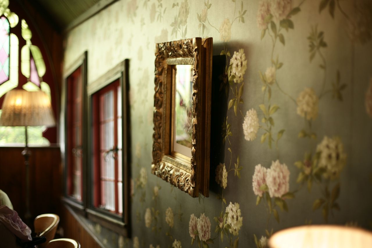
Floral wallpaper only looks dated when it's the wrong floral, used the wrong way. The modern approach hinges on three things: scale, colour, and restraint. Large, graphic blooms in confident colours read as contemporary, while small, fussy, faded sprigs are what most people picture when they say "old-fashioned." Choose deliberately and floral becomes one of the freshest looks in the room rather than the most nostalgic.
Key takeaways
- Scale is everything: large, bold blooms read modern; tiny, busy sprigs read dated.
- Contemporary colour (moody, graphic, or high-contrast) updates florals instantly.
- One floral wall plus restrained furnishings keeps the look current, not chintzy.
- Pair florals with clean-lined, modern furniture to sharpen the contrast.
- Dark or dramatic floral grounds feel especially of-the-moment.
The dated floral vs. the modern floral
The floral that feels like a grandmother's spare room is almost always small-scale, pale, and densely repeated, the "chintz" effect, where the pattern is a busy blur of tiny flowers with no space to breathe. The modern floral is the opposite: blooms drawn large, with room around them, in colours that are either moody and rich or graphic and high-contrast. Same subject, entirely different result. A well-chosen floral wallpaper in a bold scale is one of the most current looks available, precisely because it overturns the tired version people expect the moment they hear the word "floral."
Scale is doing most of the work in that transformation. A flower rendered at ten times its usual size stops reading as "pretty" and starts reading as "graphic." It becomes almost abstract, a shape and a colour as much as a bloom. That shift from decorative to graphic is the whole trick, and it's why the size of the print matters more than the flower itself.
How to keep it contemporary
| If you want to avoid... | Do this instead |
|---|---|
| Chintzy or fussy | Choose large-scale blooms with breathing space |
| Faded or dated | Pick moody, saturated, or high-contrast colour |
| Twee or cluttered | Limit floral to one wall; keep furniture clean-lined |
| Grandmillennial by accident | Contrast with modern, minimal furnishings |
The through-line is contrast. Modern florals work because everything around them is calm and current, which lets the pattern feel like a deliberate statement rather than a whole-room theme. The moment you pair a floral wall with equally ornate furniture, ruffled textiles, and more pattern, it tips straight back into the nostalgic version. Keep the company it keeps simple.
The dark floral shortcut
If you want the most contemporary version with the least guesswork, go dark. A floral on a deep, inky ground such as charcoal, forest green, or aubergine reads as dramatic and modern rather than sweet, and it's one of the strongest looks in interiors right now. The dark ground does something clever: it keeps the flowers from reading as delicate or twee, so even a traditional bloom feels bold and current. The flowers still soften the room; the dark background stops the whole thing tipping into nostalgia.
Where to use it
Floral rewards rooms you want to feel atmospheric rather than purely functional: a bedroom, a dining room, a powder room, or a feature wall in a living room. In smaller rooms you occupy for shorter stretches, a big, moody floral reads as deliberate and enveloping rather than overwhelming. Save the whole-room floral for a space where you want drama; elsewhere, one wall is plenty and keeps the look disciplined.
The takeaway
Floral isn't the problem; the wrong floral is. Go big, go confident on colour, and let the pattern stand alone against calm furnishings. Order a sample and see it under the room's evening light before you commit, because floral grounds, especially dark ones, deepen after dusk, and that richer, after-dark mood is the one you'll actually live with.
Frequently Asked Questions
Is floral wallpaper still in style?
Yes. Floral is firmly current when it's large-scale and confidently coloured. The dated version is the small, faded, densely repeated sprig; the modern version is bold blooms with space and strong colour.
How do I stop floral wallpaper looking old-fashioned?
Choose a large scale, a modern palette (moody or high-contrast), limit it to one wall, and pair it with clean-lined furniture. Scale and restraint are what separate current from chintzy.
What furniture goes with floral wallpaper?
Clean-lined, modern, relatively plain pieces. The contrast between simple furniture and a bold floral is what keeps the look sharp rather than fussy.
Are dark florals hard to live with?
Not at all. A dark floral in a bedroom or dining room feels cocooning and dramatic. Pair it with good lighting and a few lighter textiles and it stays inviting rather than heavy.